
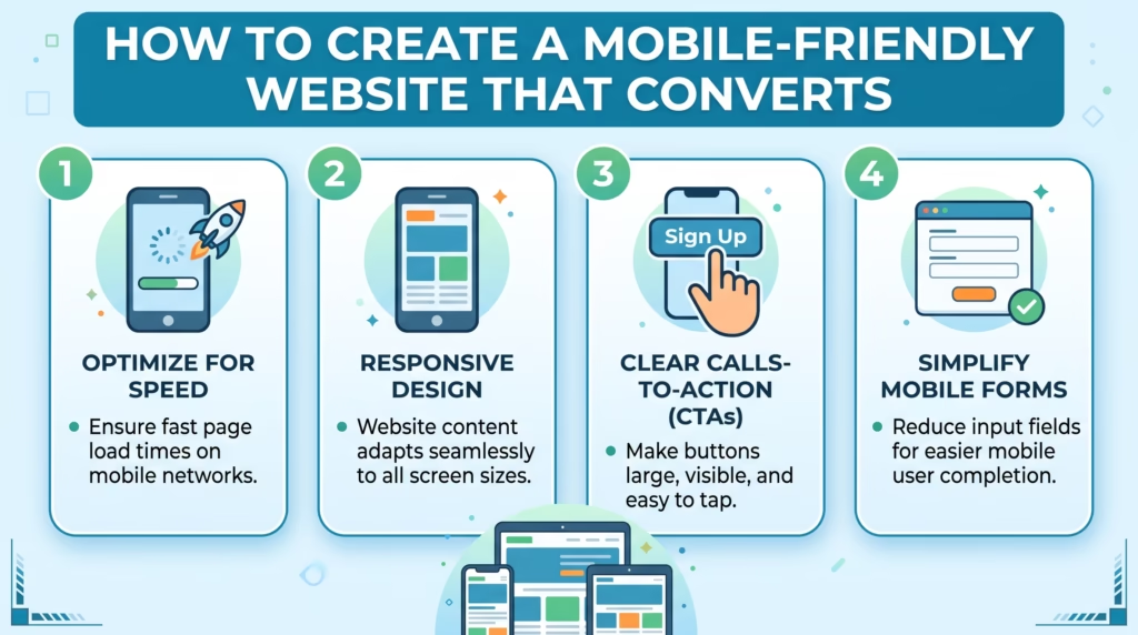
More people browse, shop, and interact with businesses through smartphones than ever before. If your website is difficult to navigate on a small screen, loads slowly, or requires users to zoom and scroll excessively, you may be losing potential customers.
A mobile friendly website adapts to different screen sizes while keeping content easy to read, navigation simple, and important actions easy to complete. A well-designed mobile experience can improve usability, support SEO, and help turn more visitors into leads and customers.
In this guide, we’ll explain what makes a website mobile friendly, how to create one, common mistakes to avoid, and how to optimize your site for better mobile performance and conversions.
Why a Mobile Friendly Website Matters
A website that works well on mobile devices provides a better experience for visitors and makes it easier for them to interact with your business.
When users can quickly find information, navigate between pages, and complete forms or purchases without frustration, they’re more likely to stay on your website and take action.
A mobile friendly website can help businesses:
- Improve the overall user experience.
- Reach visitors across smartphones and tablets.
- Increase engagement and time spent on the website.
- Support search engine visibility.
- Improve page performance.
- Generate more leads and conversions.
Mobile usability is particularly important for ecommerce stores and service businesses where visitors may contact, purchase, or book directly from their phones.
What Makes a Website Mobile Friendly?
A mobile friendly website automatically adapts its layout and content to different screen sizes. Instead of creating a completely separate website for every device, responsive design allows the same website to adjust based on the user’s screen.
Important characteristics include:
- Responsive layouts.
- Easy-to-use navigation.
- Readable text without zooming.
- Touch-friendly buttons and links.
- Properly optimized images.
- Fast loading times.
- Mobile-friendly forms.
- Content that remains accessible on smaller screens.
The goal is to make the website feel natural to use regardless of whether someone visits from a desktop, tablet, or smartphone.
Benefits of a Mobile Friendly Website
Better User Experience
Visitors shouldn’t have to pinch, zoom, or struggle to tap small buttons. A responsive layout makes information easier to read and interactions easier to complete.
A smoother experience can also reduce frustration and encourage visitors to explore more of your website.
Improved SEO and Performance
Search engines consider the mobile experience when evaluating websites. A mobile-friendly website also tends to provide a better experience for users accessing your content through mobile search.
Performance matters as well. Large images, unnecessary scripts, and poorly optimized code can make mobile pages slow, especially for users on slower connections.
Higher Conversion Rates
A mobile visitor may be ready to contact your business, purchase a product, or submit a form. If the process is difficult on a smartphone, that potential conversion can disappear.
Clear CTAs, simple forms, easy navigation, and fast-loading pages remove unnecessary friction and make it easier for visitors to take action.
Essential Elements of a Mobile Friendly Website
Responsive Design
Responsive design allows your website layout to adapt to different screen sizes. Images, columns, navigation, and other elements should automatically adjust rather than forcing users to scroll horizontally.
Your website should look and function properly across common smartphone, tablet, and desktop screen sizes.
Simple Navigation
Mobile screens provide less space for navigation, so your menu should be simple and focused.
Use clear labels and avoid forcing visitors through unnecessary menu levels. Important pages such as products, services, contact information, and account or cart pages should be easy to access.
Readable Content and Touch-Friendly Buttons
Text should be large enough to read comfortably without zooming. Links and buttons should also have enough space around them so users can tap them accurately.
Calls to action such as Get Started, Contact Us, Shop Now, or Request a Quote should be easy to identify and use.
Optimized Images and Fast Loading
Images can make a website more engaging, but large image files can significantly increase page weight.
Resize images appropriately, compress them, and use modern image formats where suitable. Also consider lazy loading for images that aren’t immediately visible.
Mobile-Friendly Forms
Long or complicated forms can be difficult to complete on smartphones.
Only request information you actually need, use appropriate input types, and make fields and buttons easy to interact with. A simpler form can make it easier for visitors to complete an inquiry or purchase.
A mobile-friendly website should do more than fit on a smartphone screen—it should provide a smooth experience that guides visitors toward becoming customers. Our Custom WordPress Website Development and SEO & Growth Optimization services are built to create responsive, fast, and conversion-focused websites.
Get in touch with TecHippo today for a free consultation and let’s build a mobile experience that helps your business grow.
How to Create a Mobile Friendly Website
Choose a Responsive Design
Start with a responsive WordPress theme or a custom responsive design. Your layout should automatically adapt to different screen sizes instead of relying on a fixed desktop layout.
Before launching, check how the design behaves across smartphones, tablets, laptops, and larger screens.
Simplify Navigation and CTAs
Review your mobile menu and remove unnecessary options. Make your most important pages easy to access.
Your calls to action should also be clear and visible. Don’t make users search for the next step after they’ve read your content.
Optimize Speed and Images
Compress images, reduce unnecessary scripts, use caching, and minimize resources that aren’t required.
You should also review plugins and third-party integrations because unnecessary functionality can add extra resources to your pages.
Test Across Different Devices
Don’t assume your website works perfectly on mobile simply because it looks good in a browser preview.
Test real devices and different screen sizes. Check navigation, forms, buttons, images, menus, page speed, and other important interactions.

Mobile Friendly Website Best Practices
Keep the Design Simple
Avoid overcrowding mobile pages with unnecessary elements. A clean design makes it easier for visitors to focus on important information and actions.
Use whitespace, clear sections, and a logical content hierarchy to guide users through the page.
Avoid Intrusive Pop-Ups
Pop-ups can be useful for promotions, newsletter signups, or other purposes, but they can become especially frustrating on small screens.
Make sure important content isn’t blocked and visitors can easily close any overlay that appears.
Prioritize Important Content
Mobile users often want information quickly. Put your most important messages, products, services, benefits, and CTAs where visitors can find them easily.
Avoid making users scroll through large amounts of unnecessary content before reaching important information.
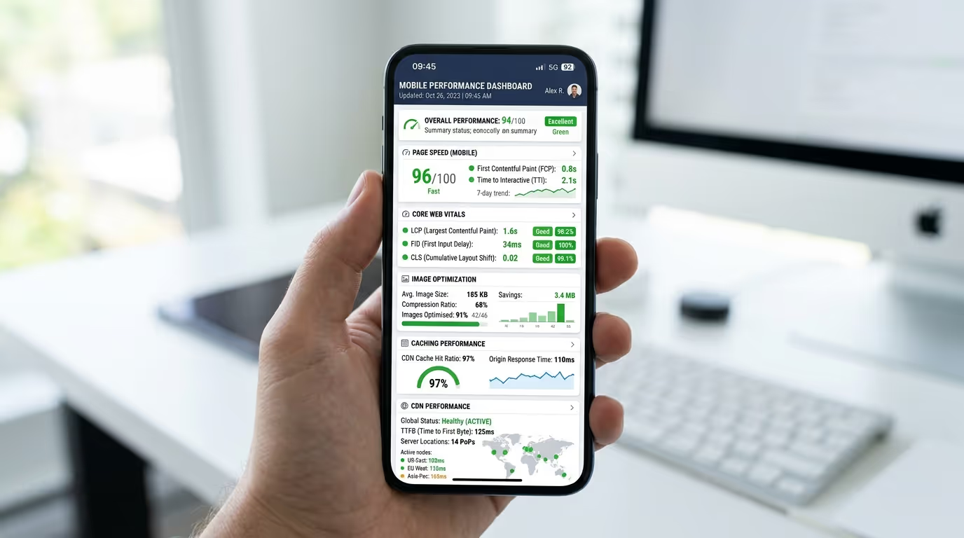
Optimize for Core Web Vitals
Core Web Vitals measure important aspects of the page experience, including loading performance, responsiveness, and visual stability.
Optimizing images, reducing unnecessary code, improving server performance, and limiting layout shifts can contribute to a better overall experience.
Common Mobile Website Mistakes to Avoid
Non-Responsive Layouts
A fixed desktop layout can force mobile visitors to zoom or scroll horizontally. Responsive design should be the foundation of a modern website.
Small Text and Buttons
Tiny text and closely positioned buttons make websites difficult to use on touchscreens.
Make content readable and provide enough space around interactive elements.
Slow Loading Pages
Large images, excessive scripts, unnecessary plugins, and poor hosting can all contribute to slow mobile pages.
Identify the biggest performance problems and optimize them instead of adding unnecessary features.
Complicated Navigation
A complicated mobile menu can make it difficult for visitors to find products, services, contact information, or other important pages.
Keep navigation focused and organize content logically.
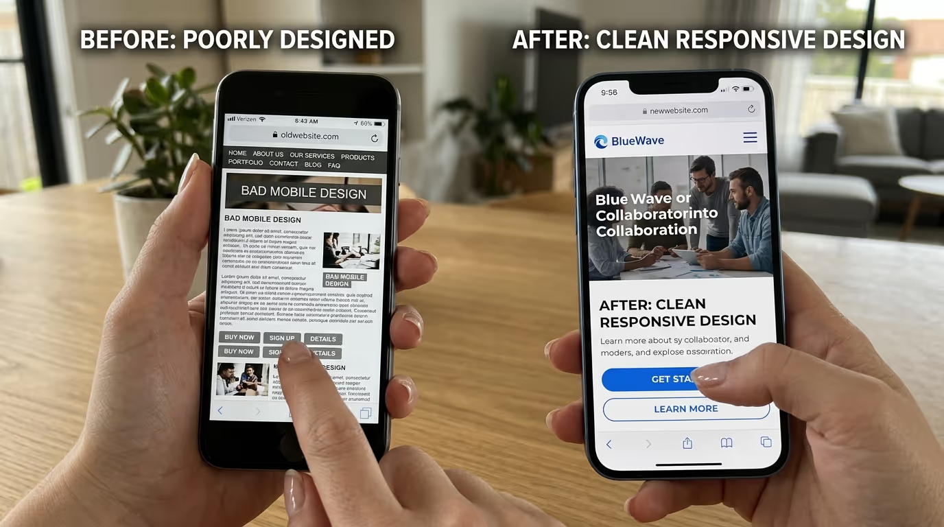
A responsive design is only the beginning. Your website also needs strong performance, SEO, usability, and conversion-focused structure to deliver results on mobile devices. Our WordPress Website Design Services combine responsive design with performance optimization and SEO strategies to create websites built around your business goals.
Get in touch with TecHippo today for a free consultation and let’s improve your website’s mobile experience.
How to Test if Your Website Is Mobile Friendly
Testing your website regularly can help identify problems that may not be obvious during normal browsing.
Google PageSpeed Insights
Google PageSpeed Insights provides performance information and recommendations for improving the experience of your webpages across different devices.
It can help identify issues involving loading performance, responsiveness, images, scripts, and other technical factors.
Google Search Console
Google Search Console provides website performance and search-related information. It can also help you identify certain issues affecting how Google interacts with your website.
Real Device Testing
Testing on actual smartphones and tablets is one of the best ways to understand the real user experience.
Check your menus, buttons, forms, images, text, page loading, and overall navigation on multiple devices and screen sizes.
Mobile Friendly Websites, SEO, and Conversions
Mobile friendliness connects SEO, user experience, and conversion optimization.
A website may attract visitors through search engines, but if those visitors encounter difficult navigation or slow pages on mobile, they may leave before completing an important action.
A mobile-friendly design helps create a smoother path from search result to webpage to conversion. Clear content, fast performance, responsive layouts, and accessible CTAs can all contribute to that experience.
Mobile Website Performance Optimization
Use Caching and a CDN
Caching can help pages load more efficiently, while a Content Delivery Network can serve static resources from locations closer to users.
Together, these technologies can help improve loading performance for visitors in different locations.
Minimize Unnecessary Code
Remove unnecessary scripts, styles, and other resources that aren’t providing value to visitors.
Reducing page weight can help improve performance, particularly for users on mobile networks.
Optimize Images
Use appropriately sized and compressed images rather than uploading unnecessarily large files.
Modern formats such as WebP or AVIF can also help reduce image file sizes when properly supported by your website setup.
Reduce Plugin Bloat
WordPress websites can accumulate plugins over time. Review your plugins regularly and remove those that aren’t needed.
Reducing unnecessary plugins can help simplify website maintenance and potentially reduce the amount of code loaded on your pages.
When Should You Make Your Website Mobile Friendly?
If your website isn’t currently responsive, making it mobile friendly should be a priority.
You should also consider improving your mobile experience if visitors frequently leave mobile pages, mobile conversions are significantly lower than desktop conversions, pages load slowly, or users report difficulties with navigation and forms.
Even if your website is already responsive, regular testing is important. Devices, browsers, plugins, themes, and website content change over time, which can introduce new usability or performance problems.
Mobile Friendly Website Checklist
Before considering your website mobile ready, check that:
- Your layout adapts to different screen sizes.
- Navigation is simple and easy to use.
- Text is readable without zooming.
- Buttons and links are easy to tap.
- Images are properly optimized.
- Pages load quickly.
- Forms work properly on mobile.
- Important CTAs are easy to find.
- Pop-ups don’t block important content.
- The website has been tested on real devices.
- Core Web Vitals are being monitored.
Your customers shouldn’t have to fight with your website to find what they need. TecHippo’s Custom WordPress Website Development, Website Speed Optimization, and SEO & Growth Optimization services help businesses create responsive websites that are fast, user-friendly, and built to convert.
Get in touch with TecHippo today for a free consultation and let’s create a mobile friendly website that turns more visitors into customers.
Conclusion
A mobile friendly website is no longer simply an optional feature. It is an essential part of providing a strong online experience.
Responsive design, simple navigation, readable content, optimized images, fast loading times, and clear calls to action can make your website easier to use and more effective at generating conversions.
By testing your website regularly and continuously improving its mobile performance, you can create an experience that works for your visitors while supporting your SEO and business growth goals.


 Reach us on WhatsApp